Introduction
The focus of this project is on understanding the workflows of designers who work with motion in product teams. There is a need for understanding and incorporating motion within the interface as motion can be used effectively to
Improve feedback
Aid in orientation
Direct attention
Show causality
Express a brand’s personality
Facebook's Reactions. A great way to showcase personality and add emotion to a user action
Motion can also play a key role in interfaces by helping reduce cognitive load on the users. Interfaces that had motion in interface elements to show the relationship between state changes were found to reduce the cognitive load on interface navigating when compared to a static interface.
Despite the growing importance of motion in enhancing interface usability, motion design remains notably absent from most UX design educational programs. Consequently, emerging designers often lack crucial skills in this vital area of UX design, leaving them unprepared to work effectively with motion designers to incorporate motion into interfaces. The knowledge surrounding motion design within the UX field is scattered and lacks a central repository, which hinders efficient learning and mastery. This gap in the educational curriculum and professional practice prompted my investigation into the following research question.
BROAD RESEARCH QUESTION
How might we enable designers to understand and incorporate motion design elements within UX Design
BROAD RESEARCH GOALS
Identify the workflow processes and communication strategies employed by UX & Motion Designers
Determine the barriers present in organization teams employing UX & Motion Designers
Design a technological system that must
Provide Information on Motion
Enable collaboration between designers and developers
Contribute to the body of knowledge on Motion Design
Background Research
Background research consisted of a literature review that spanned 43 separate artifact examinations ranging from journal articles, books, webpages and design systems.
Understanding the Background of Motion
Motion design can trace its origins to cel animation. In their book “The Illusion of Life”, animators outline the twelve principles behind animation in cartoons, demonstrating how these principles were based on natural movement observed in the world
The Illusion of Life, a book on the principle of cartoon animation that goes into detail on real world physics and metaphors are used to give 2D images the sense of movement
These principles of animation translate over to interfaces, as modern digital interfaces strive to emulate tactile objects by employing metaphors that connect to the real-world
When motion is applied to interfaces, in accordance with these principles, it has the effect of making the object's action more realistic, making it easier for users to understand elements that change on screen
Understanding Communication in UX Teams
UX practitioners employ various communication strategies, and these strategies vary based on the different types of conversations that happen, from project start to end, and how the method of communication changes.
Designers working together. Photo by airfocus from Unsplash
Changing roles of stakeholders requires different mediums, languages and skillsets to communicate across cross-functional teams
Deployment of Motion in UX
Design systems can increase cross-disciplinary and cross-functional collaboration by providing a common language and reducing disagreements between people with different backgrounds
Design system articles and explored systems.
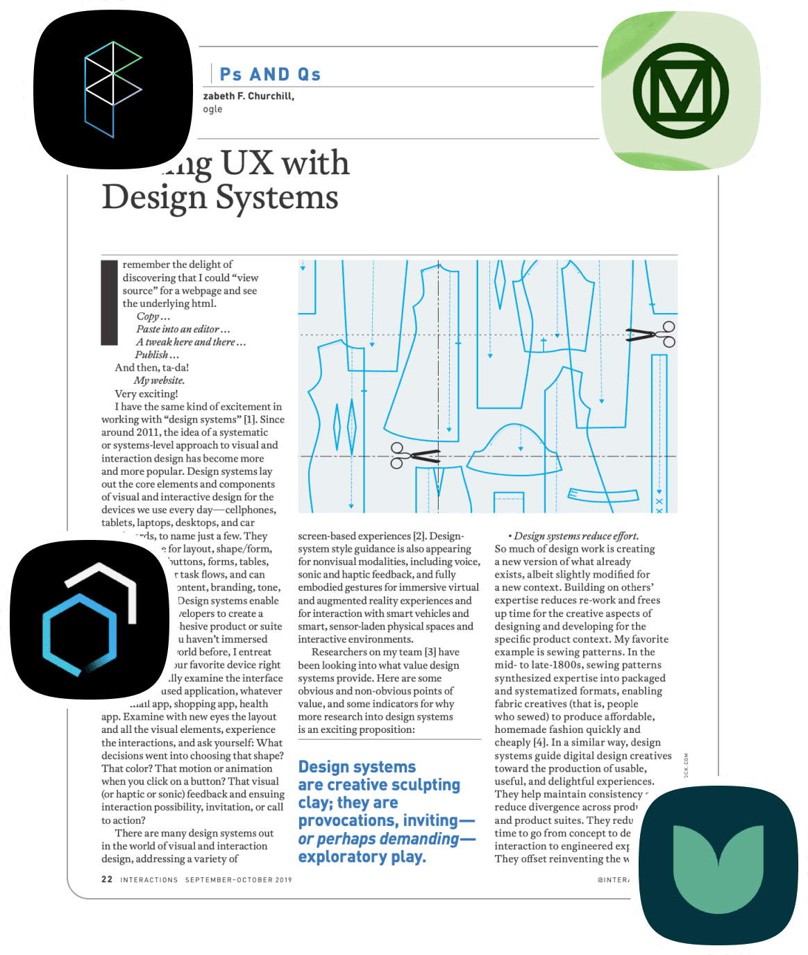
Current design systems operate on a unified grammar for components, like the atomic design style where elements are broken down into smaller units
Some of the many motion patterns in design systems, including easing curves, choreography and effects
Motion Patterns in systems include
Easing curves
Types of usage
Choreography patterns
Effect Patterns
LITERATURE REVIEW LEARNINGS
Learnings
Motion is an important aspect of the interface to provide feedback and communicate with the user
Motion is not part of curriculum in UX programs, barriers present in the learning and implementation aspect
Communication and collaboration are key barriers with teams having different stakeholders who communicate in different mediums
Design Systems have motion elements broken down and incorporated, aimed at a general audience including designers and developers
Gaps Present
What are the strategies for deploying motion used by UX teams?
How do designers in teams collaborate with stakeholders and communicate intent in motion design practices?
How do design systems help in aligning teams and how are they built?
What are the issues faced in the adoption of motion design in interfaces across the organization?
Interviewing Stakeholders
To gain insights into the gaps found in the background research, it was necessary to engage with UX practitioners who encounter these challenges. This allowed for an understanding of the strategies they employ to mitigate these issues.
22 participants
UX Motion Designer
UX Designer
Design Systems Ops
Product Manager
Motion Systems Designer
Motion Designer

1:1 Semi-Structured
1 hour interviews
Questions
Motion Design in UX
Collaboration with stakeholders
Understanding challenges in the workplace
Role of motion in Design Systems
INTERVIEW ANALYSIS
Interview analysis was carried out using affinity mapping techniques where participant responses were organized into thematic clusters. This approach facilitated the identification of common patterns, insights, and emergent themes from the diverse perspectives of the interviewees. By categorizing similar ideas and observations, we were able to synthesize the data effectively, providing a comprehensive understanding of the user experience issues faced by the practitioners.
Affinity Map of the interviews conducted, findings from the interview were grouped together thematically and higher level insights were obtained.
Interview Insights
Interview analysis was carried out using affinity mapping techniques where participant responses were organized into thematic clusters. This approach facilitated the identification of common patterns, insights, and emergent themes from the diverse perspectives of the interviewees. By categorizing similar ideas and observations, we were able to synthesize the data effectively, providing a comprehensive understanding of the user experience issues faced by the practitioners.
Insight
Motion Principles in design systems have established conventions
Resources for motion exist in design system in the form of easing curves and duration
These make up the fundamental parts of motion in interfaces
Challenges exist not in their creation but in describing how and where they are to be used
Insight
Barrier to Access of Information pertaining to Motion
Lack of knowledge on where information related to motion is present
Knowledge is distributed across various mediums
Stakeholders are not aware of motion related resources
Insight
Cross-Disciplinary Language Barriers
Designers, developers and business leaders speak different languages
There is difficulty translating from one to the other
Insight
Lack of knowledge of motion implementation among stakeholders
New hires tend to lack experience with motion in UX
Developers do not have expertise in implementing motion
REDEFINED PROBLEM STATEMENT
How might we enable designers to optimize their workflow and remove barriers to the accessibility of information pertaining to motion design in UX
GOAL REDEFINTION
Identify the workflow processes and communication strategies employed by UX & Motion Designers
Identify ways to present information to stakeholders involved in the UX Motion process
Determine the barriers present in organization teams employing UX & Motion Designers
Translate workflows between cross-functional teams
Design a technological system that must
Provide Information on Motion
Enable collaboration between designers and developers
Contribute to the body of knowledge on Motion Design
Design a technological system that must
Provide accurate information to the stakeholder
Be accessible in the flow of their workspace
Design Implications
The redefined problem statement and goals along with the established design implications were distilled to form a set of design implication which the the rules upon which the system would be built and evaluated.
Implication
Information Retrieval
System has to be able to parse through large amounts of information
System has to be able to support data retrieval among various file types
Implication
Domain Specific Language
System has to be able to process domain language specific input
System has to be able to convert queries and translate between languages
Implication
Sourcing Correct Data
System has to provide transparency in data sourcing
System has to be accessible at all times
Implication
Integration with Existing Tools
System has to integrate with existing tooling
Implication
Foster User Independence
System must enable users to operate independently without reliance on it.
System should provide tools and resources that empower users, not create dependencies.
System should let users retain autonomy and have the final say in the decisions they make.
The Design Process
User Archetypes
Getting started with the design and ideation process required creating two user archetypes to guide the design direction and requirements.
Pain Points
Communication barriers with the development team
Difficulties in finding quick, reliable answers to design questions.
Struggles with understanding motion requirements for design elements.
Challenges in applying design theories to practical coding needs.
Limited awareness of backend system constraints affecting motion design.
Goals and Needs
Seeks efficient learning methods for different motion design aspects.
Desires tools or methods to improve communication and alignment.
Requires accessible resources for immediate design-related inquiries.
Wants to resolve most design questions before project handoff to streamline workflow.
Pain Points
Navigates complex backend system limitations
Acts as a primary consultant for stakeholders on advanced motion design matters.
Encounters gaps in understanding when coordinating with developers
Integration of high-level design concepts with practical code implementation.
Goals and Needs
Requires tools for predicting and managing backend system constraints proactively.
Seeks to establish communication channels with both stakeholders
Ensures the technical feasibility and user-centric effectiveness of designs
Ideation Concepts
Based on the user archetypes and needs, three initial concept directions were explored.
Concept 1 : Motion Matrix
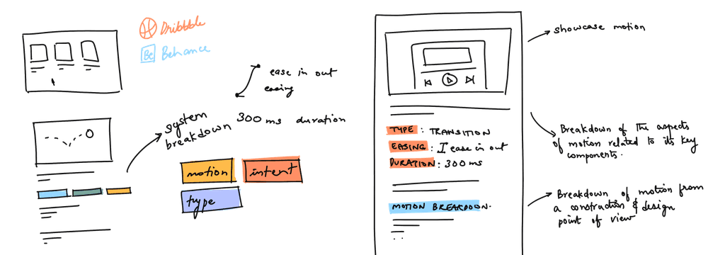
Application that serves as a motion repository to document and breakdown motion into elements
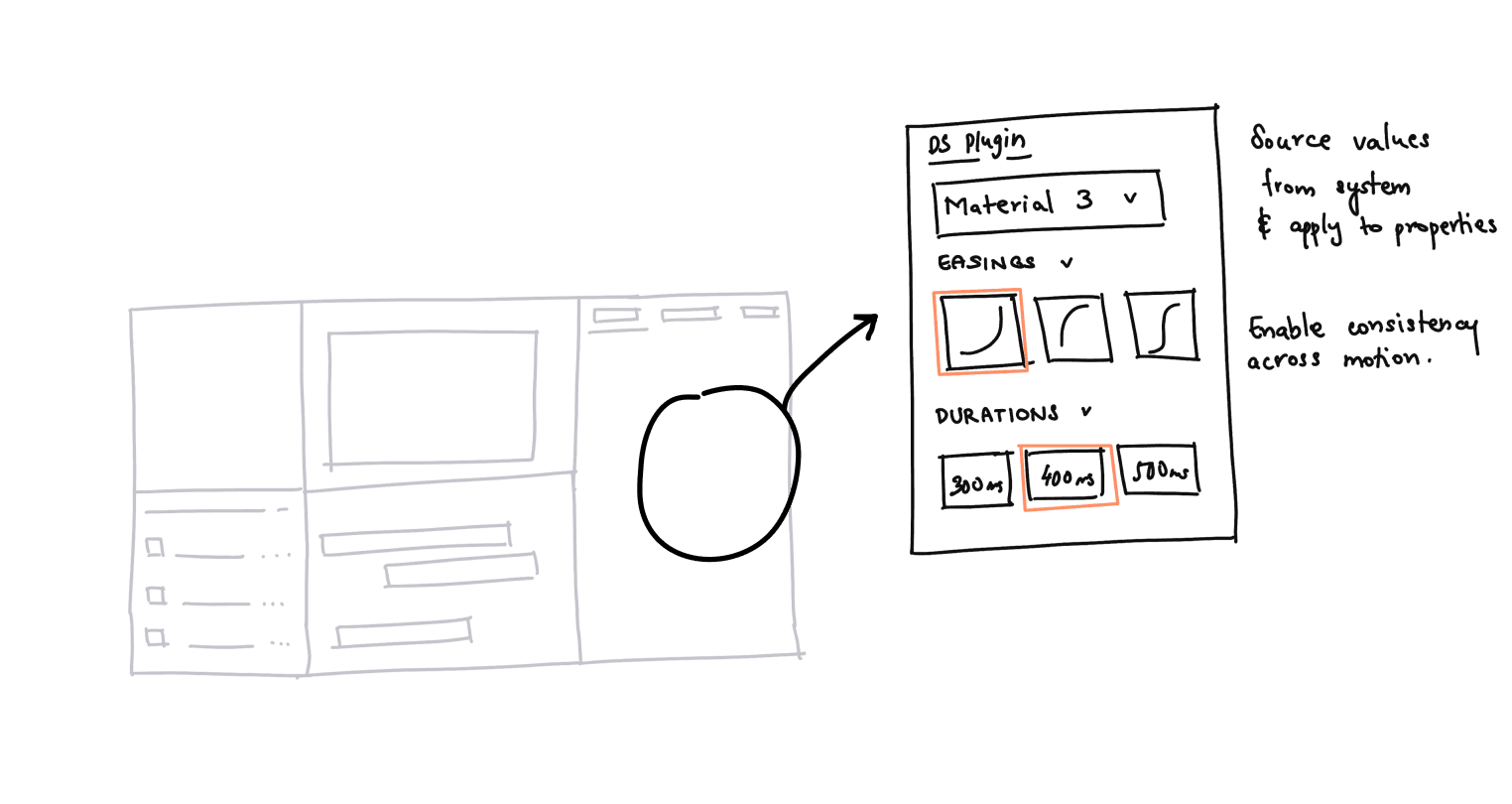
Concept 2 : DesignSync
Plugin to interface with design tools that can provide easing and duration values sourced from design systems
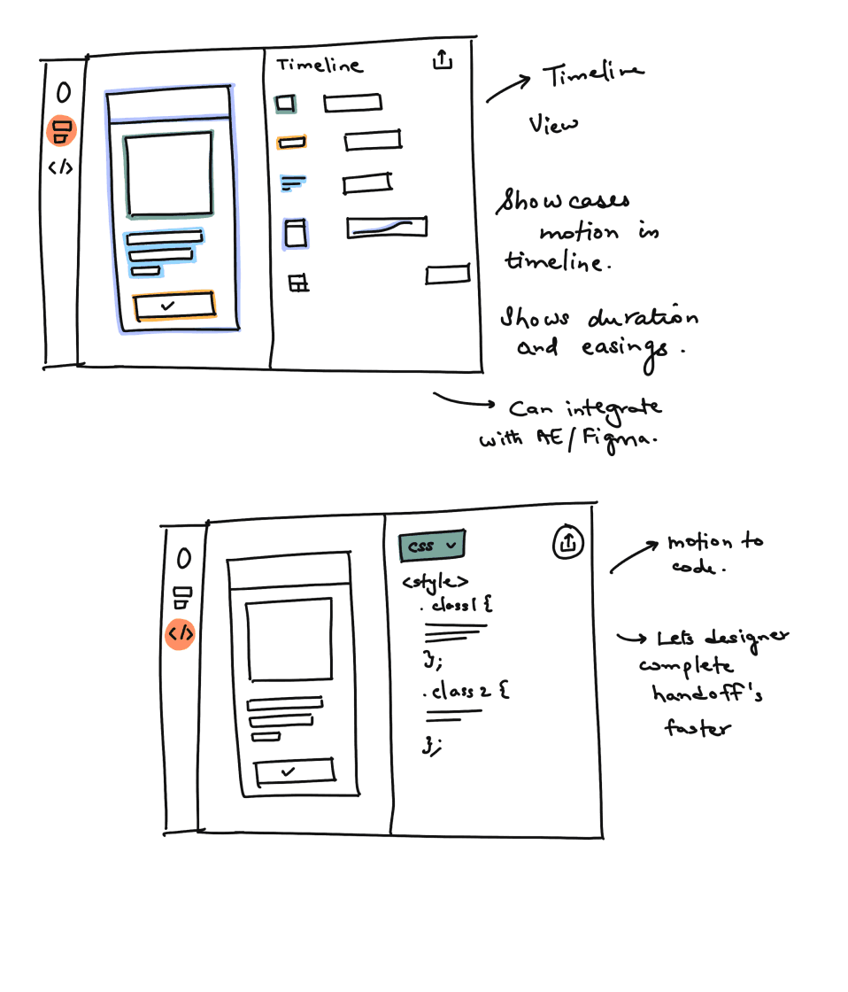
Concept 3 : Spectrum
Application that creates a spec and outputs relevant code to enable designers to hand off products to developers
CONCEPT EVALUATION
The concepts were presented to a panel of industry experts, including interaction designers and visual designers.
Meeting with a panel of industry professional to get feedback on the concepts
The design panel was the last set of evaluators and feedback on the iteration of concepts. The concepts were developed and iterated upon feedback from a select set of UX Motion designers in the industry.
Feedback provided by the expert touched upon a few key areas. They highlighted that while certain concepts hit some of the design implications, as highlighted below, they did not satisfy all of the design implications within one solution.
Design Implications and how the concepts contributed to each implication
With the feedback given, a decision was made to look into alternate technologies that could incorporate all the design implications.
One solution to meet all design implications
A Large Language Model (LLM) was identified as the optimal choice for its capacity to address multiple design needs. Its ability to understand and generate code aligns with the necessary technical comprehension for Concept 3. It can also harness and apply design system data, meeting the integration requirements of Concepts 1 and 2. LLMs facilitate implementation focus by automating design suggestions and instructions, streamlining the design process within tools for Concepts 2 and 3. Additionally, their learning algorithms can enhance motion design QA, improving quality over time as per Concepts 1 and 3. The LLM’s comprehensive capabilities make it an all-encompassing solution that fulfills the complete range of design implications.
Designing the System
With the LLM powering the platform, it was time to work on the structure of the system and how the LLM would interface with the content.
The schematic layout of the system with knowledge being input from various pipelines to the LLM to index and provide a response to the query
The LLM uses a technique known as Retrieval Augmented Generation or RAG to help it learn about data it might not have been trained on. Built using Langchain, the RAG pipeline involves having a retrieval chain that searches through and retrieves relevant information based on the user's query or prompt. If no relevant information is present, then the LLM defaults to its huge training dataset to provide the answer. Additionally, a set of system instructions are given to the LLM to enable it to clearly answer questions and to shape its general output.
You an assistant who is knowledgable in the domain of Motion Design in User Experience Design. You have knowledge on the creation, development and implementation of motion design in UX.
Your goal is to help the user understand the implementation and principles of motion design. Based on the query, address the problem, provide a solution, and then explain any shortcomings.
Provide a comprehensive evaluation of other factors to consider in the answer. Provide information to empower the user to find their solution. Do not provide a definitive response.
You have a calm and balanced personality. You do not ramble and are to the point.
LLM System Instruction
Wireframes
A quick prototype of the system was created with some wireframes as the base to build upon. The wireframes were that of a basic chatbot to answer queries presented by the user.
System Prototype
The system operates as a plugin within Figma. Figma was chosen as the platform of choice due to the platform being tailored towards collaboration among designers, developers, and other stakeholders. Additionally, Figma's plugin ecosystem was relatively faster to iterate within.
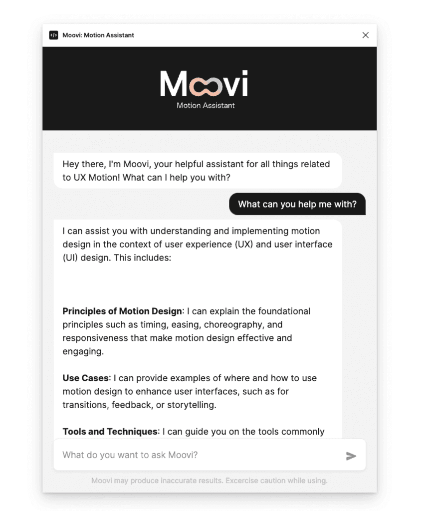
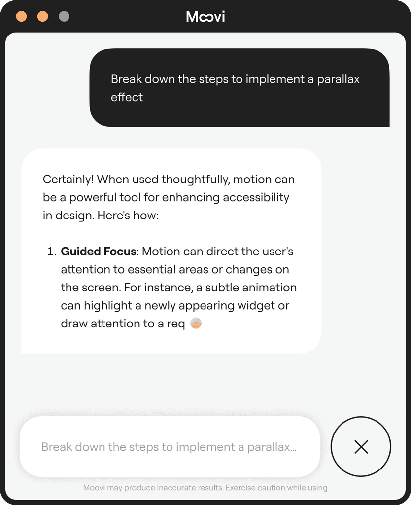
The prototype of the system was built and deployed as a Figma plugin. The system takes the form of a chatbot assistant. This assistant can take questions from the user and provide relevant answers. It can also cite where it got its information from if it has any external content fed to it.
Prompting
Response
Citing Sources
Here's a demonstration of the plugin within Figma
Moovi plugin demo within Figma
Prototype Evaluation
The goal of the evaluation was to get feedback on the prototype and understand what users thought about its usability, reliability, and veracity of information.
User Groups
Two user groups were employed; Experts and Novices to reflect the user archetypes.
Study Design
Scenario Based Testing
Perform a set of tasks and provide feedback
Qualitative Feedback
Response to a set of questions to assess if the design met the design implications
System Usability Scale
Response to a set of questions to assess the usability of the design
Experts
6 participants
Avg. YoE ~ 12 years
UX Motion Designer
UX Motion Lead
Motion Designer
Visual Designer
Creative Producer
Managing Partner
Novices
4 participants
Avg. YoE ~ 1 year(s)
Design Student
Design Student
UX Designer
Product Designer
Expert Tasks
Experts were presented with the plugin and were asked to perform a set of tasks. These tasks were related to their day-to-day work and high-level management and implementation decisions.
Some of the example tasks included:
A walkthrough of how they would use the plugin within a daily task they performed
How they would use the plugin while interfacing with developers
Using the plugin to help guide new hires on best practices
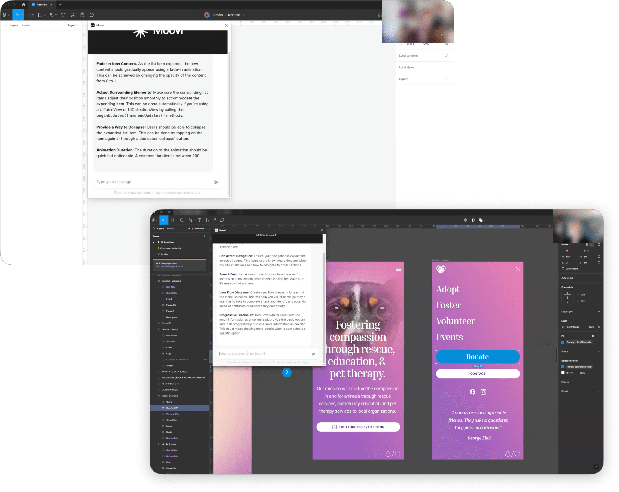
Experts using the plugin
Novice Tasks
Similar to the expert participants, novice participants were also presented with the plugin but were given a different set of tasks.
Some of the example tasks included:
Understanding the implementation of motion and its principles
Creating a motion element in Figma
Collaboration and Handoff to developers
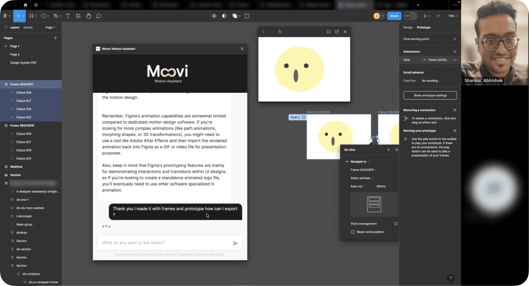
Novice designer using the plugin
EVALUATION RESULTS
Found to be very helpful in answering queries
Participants felt that the assistant understood their questions and provided relevant answers
High Confidence in the accuracy of the results
The participants felt very confident with the accuracy of the answers provided
Response provided to a wide range of queries
Design Systems
Motion Principles
Code for Android
Impact Metrics
Measuring usability for Motion
Found information from their design system docs
Created motion pieces in Figma with answers
System Usability Scale
DIFFERENCE IN OPINION
While they spoke highly of the assistant, there were differences in how experts and novices approached the system, noting some of the differences below.
Expert Observations
Knew what questions to ask the assistant
Expertise gave them ability to be confident in the accuracy of results
Wanted more control on contents of the repository that the assistant was sourcing from
Participants at specific organizations wanted the ability to run the models built by their organization and not that of their competitors
Novice Observations
Struggled with asking the assistant questions as they had no prior knowledge of the subject area.
Used the assistant as a tool to uncover more about the space and ask questions related to motion in UX
Were confident in the accuracy of the results as they tried to benchmark it with something they were familiar with, not necessarily motion.
Evaluation Learnings
The goal of the evaluation was to get feedback on the prototype and understand what users thought about its usability, reliability, and veracity of information.
The goal of the evaluation was to get feedback on the prototype and understand what users thought about its usability, reliability, and veracity of information.
Design Implication
Information Retrieval
Design Implication
Domain Specific Language
Design Implication
Sourcing Correct Data
Design Implication
Integration with Existing Tools
Design Implication
Foster User Independence
FINAL INTERFACE DESIGN EVOLUTION
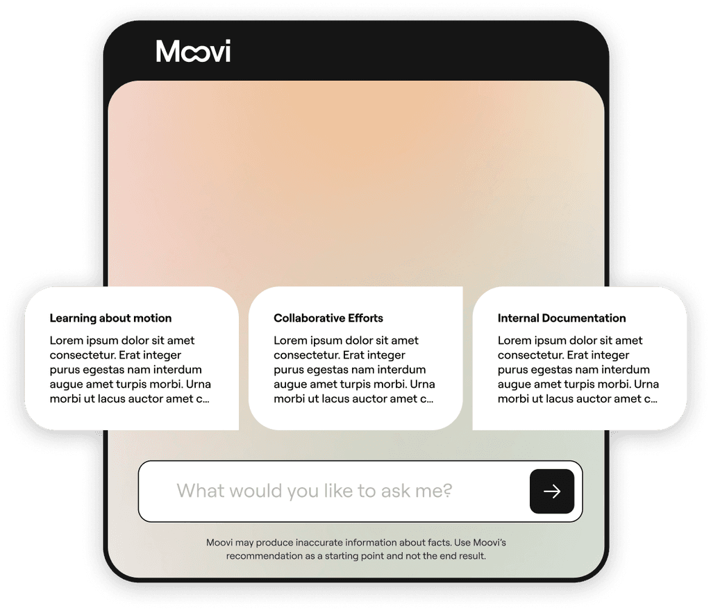
With the insights from the prototype, the final design was iterated upon. The assistant design was focused on keeping it fun and playful while giving a touch of personality with colors and gradients while still maintaining usability.
The interface was meant to provide the user with a sense of calm and composure. The soft gradient aesthetic was chosen for the interface to mimic the LLM's personality as being soft and gentle rather than overbearing. This gradient-based approach took prominence in the ideation of the interface.
Design Showcase
Presenting Moovi, an Ai-powered UX Motion assistant for Figma
Go behind the scenes of Moovi's interface
Get an in-depth overview of the elements behind Moovi's interface
The Moovi Interface
The interface was built to incorporate user needs based on the feedback obtained from the expert and novice participants. Additionally, the prototype's barebones visual elements were upgraded to align the interface with Moovi's brand direction.
Start Screen
Prompt and Response
Response Result
Varying Responses
A DASHBOARD FOR VIEWING
In addition to the assistant, users remarked that they would like to see more information about the assistant, from what LLM is powering it to the data that is being used. To accomplish this, a dashboard was created to bring all insights into one space.
A dashboard was the choice in this case, as it was determined that the interaction with the assistant within Figma needed to be as straightforward as possible. Users use Figma as a design tool, and as such, design work needs to happen in Figma. External management of plugin data is therefore carried out on a dashboard hosted externally.
DASHBOARD FEATURES
In addition to the assistant, users remarked that they would like to see more information about the assistant, from what LLM is powering it to the data that is being used. To accomplish this, a dashboard was created to bring all insights into one space.
Source Overview
Visualization of sources accessed by the assistant; based on uploaded data or internet scraping
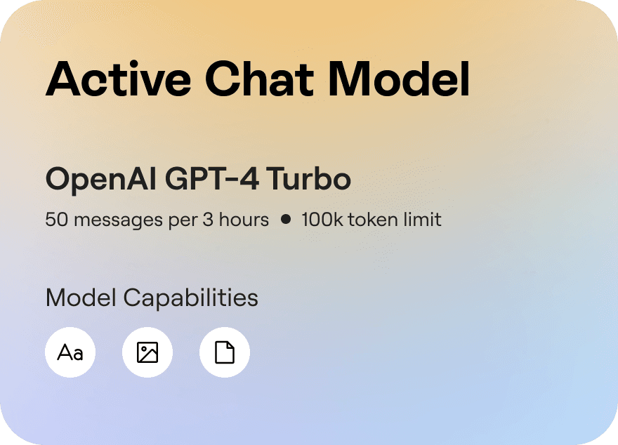
Chat Model Data
Current chat model powering the assistant and the associated costs
Quick Overview
Overview of Moovi usage including time and platforms accessed from
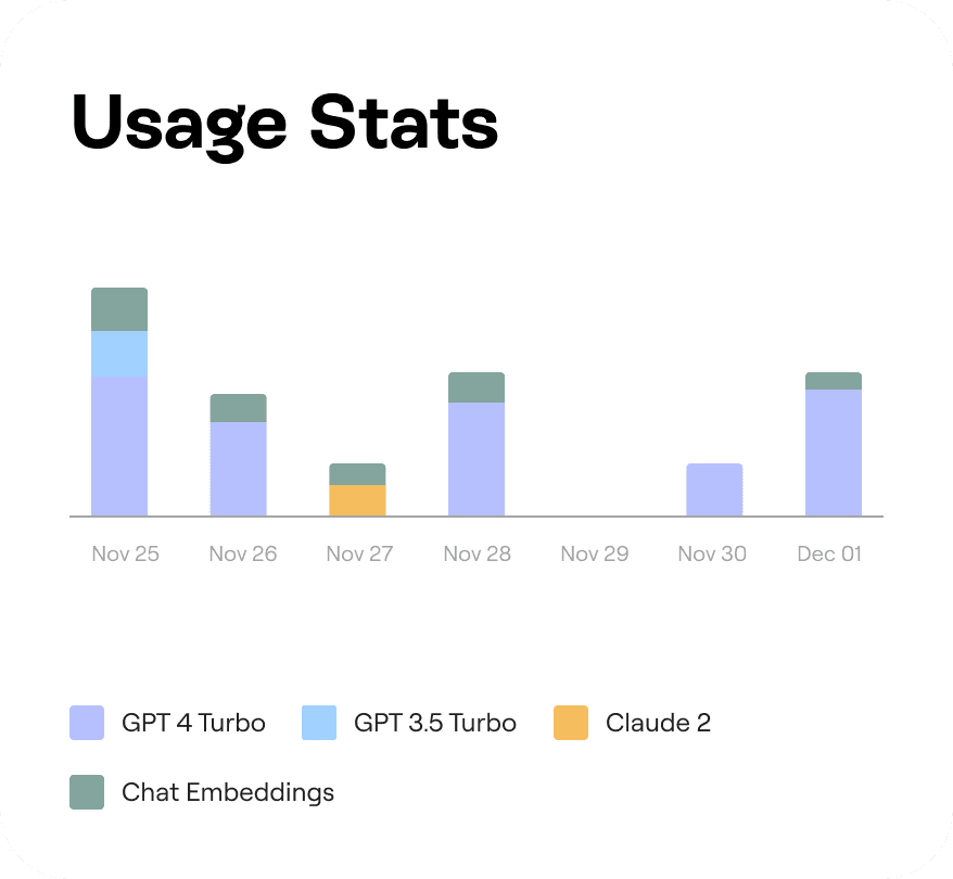
LLM Usage Statistics
Visualization to track usage of LLM models
Past Runs
Overview of recent queries to the assistant
Reflections
Creating Moovi was a year-long endeavor of learning and experimenting. Working on this project has been a source of pride as I get to this point. This project helped me meet and learn from various people about their experiences as UX and UX Motion Designers. Furthermore, I developed a skill in creating prototypes for LLM-based systems that I could quickly build and iterate upon. Additionally I learnt a lot of things in this process that I wanted to list out :
Synthesizing large amount of research data
Learning to build LLM based applications
Designing for a user group that I’m passionate about
Defining project scope
Reflecting on design process and decisions made
Limitations
Every project is not perfect, and neither is this one. As always, things are defined by constraints, and this project, like everything else, has its own set of limitations.
Only features text based input and output
Cannot read information present in the Figma file
Can produce incorrect output when faced with highly complex and organization-specific task
Future Work
Taking into account the landscape of design and the proliferation of generative AI technologies, there are a few directions that future work that builds upon this can take.
Support additional input modalities, eg. Images, Media
Expand to additional design tools like After Effects and Sketch
Explore ways to incorporate LLMs and Generative AI in design workflows that do not rely on a chatbot interaction


