


Welcome to the Moovi Design System. This page serves as the hub for the Moovi brand and design guides. You will find the principles of Moovi's design and the assets and tokens used to create shared experiences across platforms for Moovi.


The Moovi Wordmark
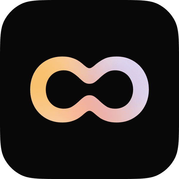
The infinite o ligature

LIGHT BACKGROUND

DARK BACKGROUND

GRADIENT BACKGROUND


LIGHT BACKGROUND

DARK BACKGROUND

LIGHT BACKGROUND

DARK BACKGROUND
The byline text content should not be longer than the Moovi wordmark

LIGHT BACKGROUND
DARK BACKGROUND

LIGHT BACKGROUND

DARK BACKGROUND

GRADIENT BACKGROUND
LIGHT
#FFFFFF
DARK
#1E1E1E
BACKGROUND
#F6F6F6
LIGHT
#1E1E1E
DARK
#FFFFFF
BACKGROUND
#070707
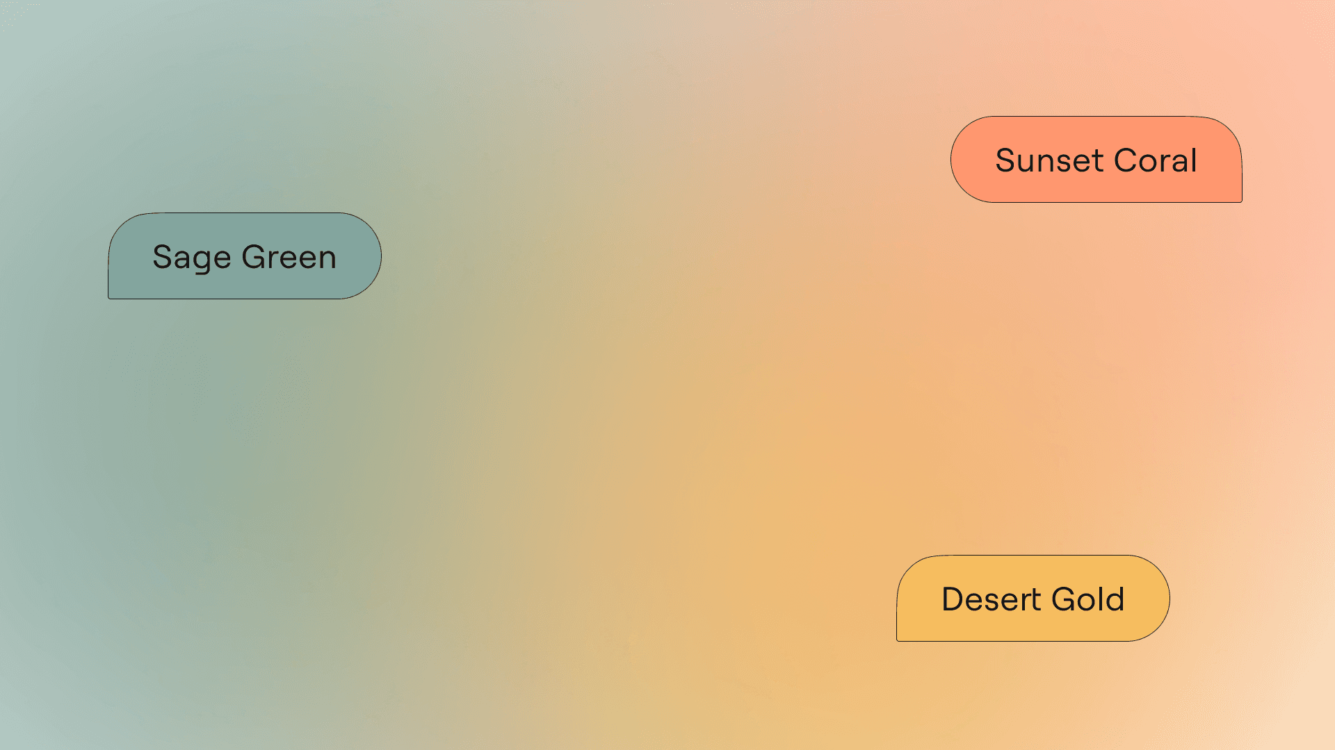
SAGE GREEN
#84A59D
SUNSET CORAL
#FF9770
GLACIER BLUE
#A2D2FF
MOUNTAIN LILAC
#B8C0FF
DESERT GOLD
#F6BD60


SUCCESS
#FFFFFF
WARNING
#1E1E1E
ERROR
#F6F6F6
ACCENT GREY
#A4A4A4
ES Rebond Grotesque
HEADINGS AND CAPTIONS
Roobert Pro
BODY AND INTERFACE
Martian Mono
CODE BLOCKS

Explain the concept
of easing in motion design
.card {
width: 375px;
padding: 20px;
background-color: #1E1E1E;
}
Heading 1
69 px / 117%
ES Rebond Grotesk
Heading 2
44 px / 125%
ES Rebond Grotesk
Heading 3
35 px / 133%
ES Rebond Grotesk
Heading 4
48 px / 120%
Roobert Pro
Heading 5
23 px / 140%
Roobert Pro
Body
18 px / 150%
Roobert Pro
Caption
14 px / 143%
Roobert Pro
Lorem ipsum dolor sit amet consectetur. Ut ultricies porttitor lectus consectetur fames. Nulla vivamus id libero sed nunc sed.
USER QUERY BUBBLE
Lorem ipsum dolor sit amet consectetur. Ut ultricies porttitor lectus consectetur fames. Nulla vivamus id libero sed nunc sed. Ultricies at quisque senectus mattis id donec. Malesuada mattis nec vivamus etiam tempus gravida proin. Est sed augue ornare justo pellentesque. Mauris elementum consectetur rhoncus ornare faucibus ullamcorper faucibus risus. Habitasse leo donec massa etiam consequat vel.
SYSTEM RESPONSE BUBBLE

<div class="card">
<div class="logo-title">
<img src="logo.png" alt="Logo" class="logo">
<h1 class="logo-title-text">Logo</h1>
</div>
<p class="body-text">
Lorem ipsum dolor sit amet, consectetur adipiscing elit. Nullam aliquam ipsum gravida rutrum proin ut et penatibus. Natoque.
</p>
<div class="switch-line">
<div class="switch"><div>
<p class="accept-text">I accept</p>
</div>
<button class="proceed-button">Proceed button>
</div>
CODE BLOCK

INLINE CITATION
Source Citation
CITATION TAG
Explain the concept
of easing in motion design
STARTER PROMPT BUBBLE
Explain the concept
of easing in motion design
Break down the steps
to implement a parallax effect
Explain how motion
can enhance accessibility in design
STARTER PROMPT GROUP
Lorem ipsum dolor sit amet consectetur.
USER INPUT FIELD
ICON BUTTON
Create New Chat
ACTION BUTTON
View More
TEXT BUTTON
Light Mode
Dark Mode
--color-bg-primary
#F6F6F6
--color-bg-primary-hover
#CCCCCC
--color-bg-secondary
#A4A4A4
--color-bg-tertiary
#FFFFFF
--color-bg-disabled
#DBDBDB
--color-bg-tertiary-green
#84A59D
--color-bg-tertiary-coral
#FF9770
--color-bg-tertiary-gold
#F6BD60
--color-bg-tertiary-blue
#A2D2FF
--color-bg-tertiary-lilac
#B7C0FF
--color-bg-success
#4EA46B
--color-bg-warning
#FFB339
--color-bg-error
#E12D2D
--color-text-primary
#1E1E1E
--color-text-secondary
#A4A4A4
--color-text-disabled
#F8F8F8
--color-text-success
#4EA46B
--color-text-warning
#FFB339
--color-text-error
#E12D2D
--color-icon-primary-green
#84A59D
--color-icon-primary-coral
#FF9770
--color-icon-primary-gold
#F6BD60
--color-icon-primary-blue
#A2D2FF
--color-icon-primary-lilac
#B7C0FF
--color-icon-secondary
#1E1E1E
--color-icon-tertiary
#FFFFFF
--color-icon-disabled
#F8F8F8
--color-icon-success
#4EA46B
--color-icon-warning
#FFB339
--color-icon-error
#E12D2D
--color-border-primary
#A4A4A4
--color-border-secondary
#1E1E1E
--spacing-xs
8 px
--spacing-s
16 px
--spacing-m
24 px
--spacing-l
32 px
--spacing-xl
48 px
--spacing-xxl
64 px
Border Radius Tokens
--border-radius-s
16 px
--border-radius-m
24 px
--border-radius-l
32 px
--border-radius-xl
64 px